Jane's Tears
Pitch Deck


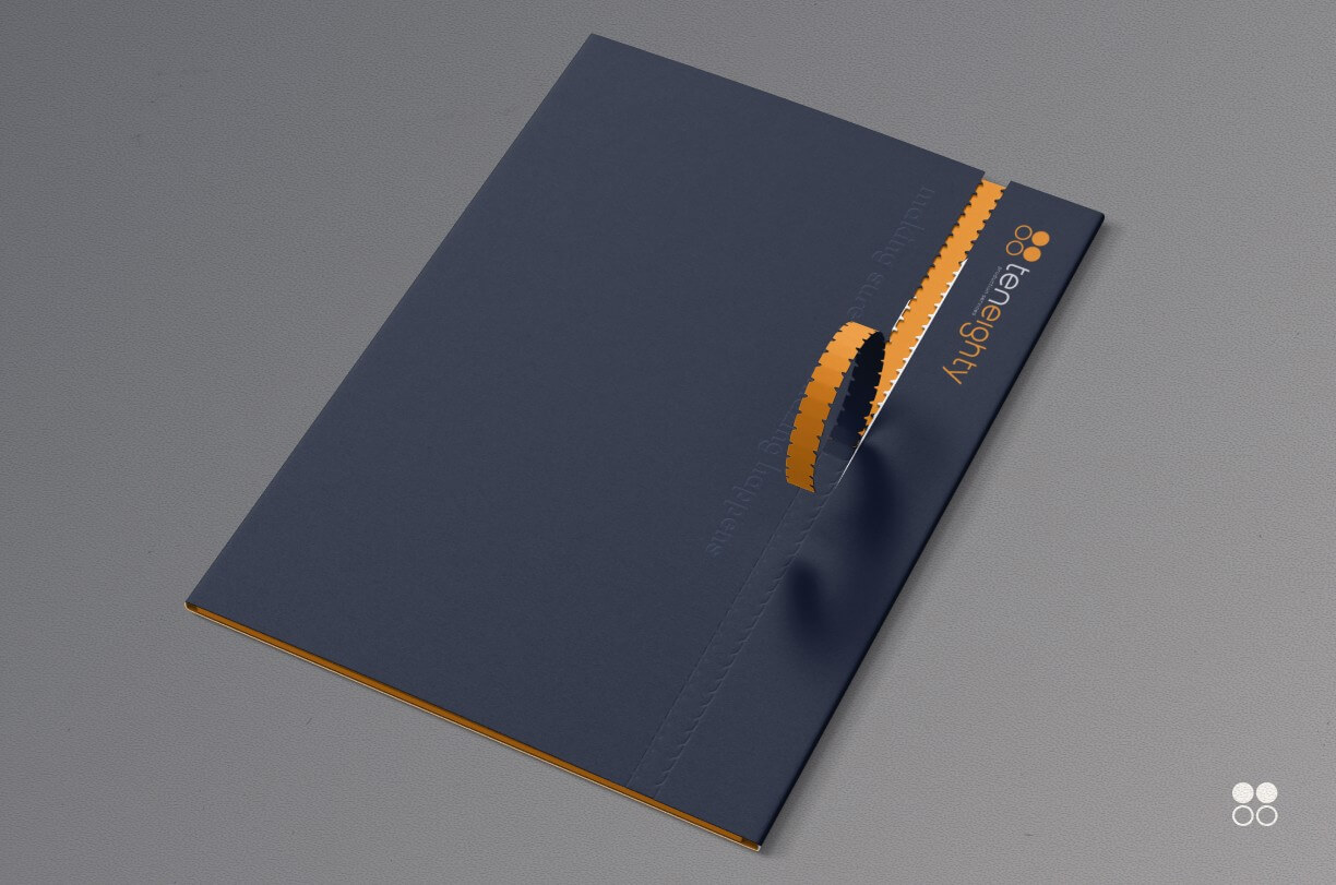
teneighty is a production service company, in Asia, working with some of the top studios including Disney, Marvel, Apple, and ILM.
Noah, teneighty's executive producer, contacted me to help with teneighty's rebranding. Over the years teneighty had grown into a different company and their branding at the time no longer reflected the company they had become.
We had a few discussions about what is teneighty and what it means to work with teneighty, at one point Noah commented:
"If they don't know what a production service company is, they are not our clients."
Which became the bases of the brand messaging and approach:
"teneighty is focused on delivering excellence for the best companies. There is no need to explain features and benefits, or for a service list. Our clients know what to expect from a production service company, and they know that we do an amazing job."
With that in mind teneighty needed to reflect the way teneighty works, smart, and professional.
The previous logo was well designed and used Helvetica as the main font, which has been the go to font for any designer using a MacBook.
The problem was that because it became THE go to font, by 2020 everyone had used it for their logos and made it hard for teneighty to stand out.
We explored different options, but decided to keep the four circles the same, while only tightening the spacing and outline size. Instead I focused on finding a better font, and the functional usage of the overall brand.
We also changed the logo's subtitle. The previous full subtitle "film + video production services" felt clunky and unnecessary, so we shortened the subtitle to "production services".
Because teneighty worked mostly remotely, there weren't many brand touch points to play with.
So instead I focused on making their documents more minimalistic, and easy to read, as invoices and estimates on film productions could get really detailed.
Before the handover brand guide handover, I actually felt very uncomfortable about sending Noah and his team a branded PDF with all their assets to download.
I kept feeling like keeping track of teneighty's "source of truth" was going to be hard, since a PDF could get lost, or have out of date items. Especially since all of teneighty's team worked remotely.
That sparked the idea that teneighty's branding assets, and documents needed to be taken online.
I felt like it would help the team get what they needed efficiently. This online brand guide included all of teneighty's logos, how to use them, teneighty's invoices, estimates, call sheets.
I even included tutorials to help with their email system, as well as best practices for using teneighty's brand assets and the website.
to keep things easy to use I made sure that there was a quick menu system for them to navigate, helping them quickly find the documents they needed.

Noah later told me:
"The team LOVES the branding website."
He told me that they were able to work so much faster, and I even got a nice email from one of the team members thanking me for the tutorials, which was super nice. 💪
Once the branding was set, next was teneighty's website.
The purpose of the website was to showcase teneighty's work, team, and philosophy.
Because the branding reflected teneighty's dedication to excellence, I wanted to draw from their own clients' websites.
Inspired by apple's product copywriting style, of pairing beautiful imagery with short engaging headlines.
We chose the headline, "making sure the amazing happens", as the main brand message. The website later flowed on to showcasing teneighty's work, team, contact, and newest projects.

The website was generally well received, and they loved the flow.
Noah mentioned he got comments from both clients and even random visitors that they loved the site as well.